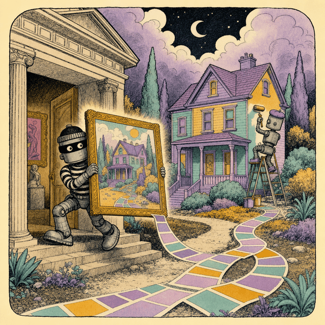
Agents ship generic design because every unconstrained choice defaults to the most probable one, and most-probable everywhere means forgettable. This kit fixes it in one paste: screenshot a site you admire, run the heist prompt, get a complete DESIGN-KIT.md (tokens, type scale, spacing, components with states, do/don't rules) your agent follows on every build. You walk away with the prompt, three variants, and a full worked example kit.
LAST VERIFIED 2026-07-08
NOTE
Use this page as a prompt reference. Every file below is built to be handed straight to an AI. Download it, drop it into Claude, ChatGPT, Cursor, or Lovable, and say "use this as my playbook." The prompts on this page are copy-paste ready.
Your agent isn't a bad designer, it's an average one (which is worse)
Ask an agent to "make it look nice" and you get the statistical center of every website ever built: Inter, a purple-to-blue gradient, soft rounded cards, shadow-md, gray-50 background. Not ugly. Just instantly forgettable, and identical to the other 500 vibe-coded apps shipped that week.
That's not a model failure. Design is thousands of tiny decisions (this padding, that weight, this hover state), and with zero constraints the model picks the most probable answer for each one. Most-probable at every single decision equals generic overall. The fix is not a better adjective in your prompt, it's removing the decisions entirely.
A design kit does exactly that: one markdown file that pre-answers the decisions. Colors as named tokens with hex. A type scale with sizes and weights. A spacing scale. A shape language. Do/don't rules. Once that file sits in your repo, the agent stops choosing and starts complying, and every screen it builds belongs to the same family.
NOTE
The move: you don't write the kit by hand. You screenshot a site whose design you admire, run the heist prompt below, and get the kit in one shot. 5 minutes, one paste.
To be clear about the word "heist": you are stealing the system (the ratios, the contrast logic, the rules), not the assets. Every designer alive learned this way. The legal line is covered in the ethics section below, and the prompt itself is built to keep you on the right side of it.
What "generic" costs you
Without a kit
With a kit
Every new page drifts: new grays, new radii, new shadows
Every page derives from the same 10-15 tokens
"Make it look better" loops, 3-6 revision rounds per screen
1 build pass, because taste was decided upfront
Looks like a template, converts like one
Looks intentional, which is what people actually pay for
Restyling later means touching every file
Restyling means editing one token block
The Heist Prompt: screenshot in, design system out
Here's how the heist runs, start to finish:
1
Pick your mark
Find a site whose design you'd be proud to live inside. Not the most famous one, the one whose FEEL matches your product. Land pages of well-designed dev tools, indie SaaS, and design studio sites are the richest targets.
2
Take one clean screenshot
Full-width, desktop, above the fold plus one scroll if you can. Higher resolution = better hex and px extraction. Skip cookie banners and popups (close them first).
3
Fill the 4 slots and paste
The prompt has slots for your product, its 3-word personality, your stack, and what the screenshot shows. Fill them, attach the screenshot, send to Claude or any vision model.
4
Save the output as DESIGN-KIT.md
Drop it in your repo root. That file is now the law for all UI work.
The prompt below is long on purpose. Every section header in it forces the model to commit to numbers instead of adjectives, and the "extract, don't copy" directive is what keeps the output reusable and legal. Don't trim it.
PROMPT: THE HEIST PROMPT (paste with 1 screenshot attached)
You are a senior design systems engineer doing a reverse-engineering pass on a screenshot. Your job is to EXTRACT THE SYSTEM behind the design, not to copy the design. The output will be used as a standing constraint file for an AI coding agent building a different product, so every rule you write must be reusable, semantic, and self-contained.

CONTEXT
- My product: [ONE-LINE DESCRIPTION OF YOUR PRODUCT, e.g. "a habit tracker for freelancers"]
- My product's personality in 3 words: [e.g. "calm, precise, friendly"]
- Target stack: [e.g. "Next.js + Tailwind" / "plain CSS" / "React Native"]
- The screenshot shows: [e.g. "the marketing homepage of a site I admire, above the fold"]

INPUT
The attached screenshot(s). Analyze only what is visible. Where you must infer (exact hex, exact px), give your best estimate and mark it with `(est.)`. Never invent elements that are not in the screenshot.

PRIME DIRECTIVE: EXTRACT, DON'T COPY
1. Extract the DECISION SYSTEM (ratios, scales, contrast logic, spacing rhythm, personality rules), not the pixels.
2. Rename every color semantically (`--color-surface`, `--color-accent`, `--color-ink`). Never name a token after the source brand.
3. For every group of choices, write one sentence explaining the FEEL it creates and the rule behind it (e.g. "shadows are absent because the design gets depth from borders, which reads as honest and technical").
4. FLAG anything that must NOT be reused: logos, mascots, brand names, specific illustrations, distinctive proprietary typefaces, any element so iconic it identifies the source brand. Put these in a "Do not lift" list with suggested legally-safe substitutes (e.g. "distinctive custom display font -> use a similar open-license font such as a grotesque from Google Fonts, name the closest 2-3 candidates").
5. If a choice looks accidental or inconsistent in the screenshot, say so and propose the systematized version. You are extracting the ideal system this designer was aiming at.

OUTPUT
Produce ONE markdown file named `DESIGN-KIT.md`, no preamble, no commentary outside the file, with EXACTLY these sections in this order:

## 0. Design DNA
- 5 sentences max. What is the aesthetic (name the genre: e.g. neo-brutalist, soft SaaS, editorial, terminal-chic)? What feeling does it produce in the first 2 seconds? What are the 3 load-bearing decisions that create that feeling?

## 1. Color Tokens
- A markdown table: token name | hex | role | usage rule.
- Semantic names only: surface / surface-raised / ink / ink-muted / accent / accent-ink (text on accent) / border / danger / success. Add more only if visible.
- Exact hex where readable, `(est.)` where sampled from small areas or gradients.
- State the contrast logic in one line (e.g. "ink on surface targets roughly 15:1, muted text roughly 6:1").
- State the accent budget: what percentage of any given screen may be accent-colored, and where accent is allowed (links, primary buttons, one highlight per section, etc.).
- If a dark or light counterpart is visible, include it. If not, do NOT invent one here.

## 2. Type Scale
- Font families by role (display / body / mono if present), with 2-3 open-license fallback candidates if the original looks proprietary.
- A table: step name (display-xl, h1, h2, h3, body, small, caption) | size px | weight | line-height | letter-spacing | usage.
- The scale's ratio if one is detectable (e.g. roughly 1.25 modular), `(est.)` if inferred.
- Case rules (any all-caps usage, where, at what tracking).
- Max line length for body text, in ch.

## 3. Spacing Scale
- The base unit (e.g. 4px or 8px) and the scale steps actually in use (e.g. 4, 8, 12, 16, 24, 32, 48, 64, 96).
- Rules of rhythm: section vertical padding, gap between heading and body, card internal padding, grid gutter. Give numbers.
- Density verdict in one line: airy / medium / dense, and where the whitespace is concentrated.

## 4. Shape Language: Borders, Radii, Shadows
- Radius scale (e.g. 0 everywhere, or 8px cards / 999px pills) with a rule for which elements get which.
- Border weight(s) and color token used; when borders replace shadows or vice versa.
- Shadow recipe(s) as exact CSS if shadows exist (e.g. `0 1px 2px rgba(0,0,0,.06)`), or an explicit "no shadows, depth comes from X" rule.
- Any signature shape moves (offset borders, hard shadows, underline styles, divider styles).

## 5. Component Inventory
For EVERY distinct component visible in the screenshot (buttons, inputs, cards, nav, badges, tabs, footer, etc.), a subsection with:
- Anatomy: padding, radius, border, background token, text style.
- States: default, hover, active, focus, disabled. If a state is not visible, DERIVE it from the system's logic and mark it `(derived)`, e.g. "hover: background shifts one surface step, no color change (derived)".
- One usage rule (when to use / when not).

## 6. Motion Rules
- Only what is inferable from the design language plus sensible defaults for the genre. Be explicit that motion is inferred.
- Durations (e.g. 120-200ms micro, 250-350ms layout), easing (name a curve, e.g. `cubic-bezier(0.2, 0, 0, 1)`), what animates (opacity, transform only) and what never animates.
- A reduced-motion rule.

## 7. Voice of the Visuals
- 5-8 adjectives the visuals communicate.
- Copy style implied by the design (sentence case? terse labels? playful microcopy?).
- Iconography style (stroke weight, filled vs outline, corner style).
- Imagery/illustration rules if any are visible.

## 8. Do / Don't
- 6-10 DO rules an agent can follow mechanically (e.g. "DO use border, never shadow, to separate cards").
- 6-10 DON'T rules, each one guarding against the most likely generic-AI drift (e.g. "DON'T add gradients; this system is flat", "DON'T center body text").

## 9. Do Not Lift (Legal/Brand Flags)
- Bullet list of everything from the screenshot that is brand-identifying or likely protected: logo, wordmark, mascot, taglines, custom illustrations, proprietary typeface names, unique iconic layouts. For each, one safe substitute.

## 10. Agent Bootstrap
- A ready-to-paste CSS `:root` block (or Tailwind theme snippet if the stack slot says Tailwind) containing every color, radius, shadow, and spacing token defined above.
- A one-line standing instruction I can put in my agent's config, phrased as: "Follow DESIGN-KIT.md for all UI work. When a value is not covered, derive it from the nearest token; never invent new colors, fonts, radii, or shadows."

QUALITY BAR
- Every value is a number or a hex, not an adjective. "Generous padding" is a failure; "32px card padding" is a pass.
- An agent that has never seen the screenshot must be able to build a NEW page that feels like it belongs to this family, without producing a clone of the source site.
- If the screenshot is too low-resolution to read a value, say so for that value rather than guessing wildly.
Why each part of the prompt is there
Prompt section
What it prevents
Prime directive: extract, don't copy
A clone of the source site instead of a reusable system
Semantic token names
Tokens named stripe-purple that leak the source and break when you retheme
(est.) marking
The model confidently hallucinating hex values it can't actually read
FEEL sentences per section
A kit that's technically complete but the agent can't extrapolate from
Derived states marked (derived)
Missing hover/focus/disabled states, the #1 gap in vibe-coded UI
Do Not Lift section
You accidentally shipping someone's mascot or proprietary font
Agent Bootstrap (:root block)
A kit that's prose-only and never actually reaches the CSS
WATCH OUT
Gotcha: if your screenshot is under roughly 1200px wide, hex and px estimates get noticeably worse. The prompt tells the model to flag unreadable values instead of guessing, but feed it a full-resolution screenshot anyway. On macOS: Cmd+Shift+4, then spacebar, click the browser window.
[ ]Screenshot is desktop-width, full resolution, no cookie banner
[ ]All 4 [SLOTS] filled (product, 3-word personality, stack, what the shot shows)
[ ]Output saved as DESIGN-KIT.md in repo root
[ ]Skim section 9 (Do Not Lift) before you build anything
[ ]The :root block from section 10 actually pasted into your global CSS or Tailwind config
Wiring the kit into your agent (3 lines, done)
A kit that lives in your Downloads folder does nothing. Three integration levels, use all three:
1
1. Put the file in the repo
DESIGN-KIT.md at repo root (or docs/DESIGN-KIT.md if you keep a docs folder). Agents can only follow files they can read.
2
2. Reference it from CLAUDE.md (or AGENTS.md)
Add the standing rule below to your agent config file so every session loads the constraint without you repeating it.
3
3. Paste the bootstrap tokens into code
Section 10 of every kit is a ready :root block or Tailwind theme. Paste it into globals.css or tailwind.config. Now the tokens exist in two places the agent checks: prose rules and actual code.
CLAUDE.md (add this block)
## Design

Follow DESIGN-KIT.md for all UI work. When a value is not covered,
derive it from the nearest token. Never invent new colors, fonts,
radii, or shadows. If a request conflicts with the kit, say so
before building.
And the one-line version, for when you're prompting in a tool without a config file (v0, Lovable, a fresh chat):
PROMPT: The one-line rule (paste at the top of any UI prompt)
Follow the attached DESIGN-KIT.md exactly for all UI work: use only its color tokens, type scale, spacing steps, radii, and shadows. Derive anything uncovered from the nearest token. Never introduce new colors, fonts, or effects. Flag conflicts instead of improvising.
PAYOFF
What changes in practice: before the kit, my UI prompts averaged 3-4 "no, less rounded, different blue" follow-ups per screen. After, most screens land in 1 pass because the agent never had those choices to fumble. That's the whole product: fewer decisions, fewer retries.
When the agent drifts anyway
It will, occasionally, especially deep into a long session when the kit has scrolled out of attention. Two fixes:
[ ]Re-anchor: "Re-read DESIGN-KIT.md, then audit the last component you built against sections 1, 4, and 8. List violations, then fix them."
[ ]Lint the tokens: grep the diff for raw hex values and px literals that aren't in the kit. Any hardcoded # outside your tokens file is drift.
[ ]Update the kit, not the prompt: if you keep overriding the same rule, the rule is wrong. Edit DESIGN-KIT.md once instead of arguing every session.
Worked example: a playful-brutalist kit, in full
Below is a complete, real output of the heist prompt, run against a fictional playful-brutalist site (think loud sticker-shop energy: hard black borders, offset shadows, one screaming yellow). I'm including the whole file so you can calibrate what "good" looks like before you run your own heist.
Things to notice as you read it:
[ ]Every value is a number or a hex. "Generous padding" appears nowhere; "24px card padding" does.
[ ]Tokens are semantic (--color-ink, --color-accent), so you can retheme by editing 11 lines.
[ ]Derived states are labeled `(derived)`, so you know which rules came from the screenshot and which from the system's logic.
[ ]Section 8 (Do/Don't) is written for a machine, each rule mechanically checkable: "no shadows with blur" is grep-able, "keep it clean" is not.
[ ]Section 9 names what NOT to take: the mascot, the wordmark, the proprietary font, each with a legal substitute.
A taste of the file, the part agents benefit from most, the do/don't list:
example-design-kit.md (excerpt, section 8)
DO:
1. Outline every raised element with 2px solid --color-ink.
2. Use hard offset shadows (4px 4px 0) only on interactive elements.
3. Keep accent yellow under 10% of the viewport.
4. Use the press-flat active state on everything clickable.

DON'T:
1. Don't use gradients, blur, or glassmorphism anywhere.
2. Don't use soft shadows (rgba blur shadows are banned).
3. Don't use gray borders; borders are ink or they don't exist.
4. Don't center body text; only hero headings may center.
NOTE
If your product actually suits the playful-brutalist vibe, you can use this example kit directly. It's fully original (extracted style genre, not any specific site) and the bootstrap :root block in section 10 drops straight into a Tailwind or plain-CSS project.
The legal line: steal systems, not assets
Short version: styles and systems are how design has always propagated. Specific assets are property. The heist prompt is built around that line, but you should know where it sits.
Fair game (systems)
Off limits (assets)
A color relationship (warm off-white surface + near-black ink + one loud accent)
The exact logo, wordmark, or mascot
A type scale ratio and weight logic
A proprietary licensed typeface's font files (use an open-license lookalike)
Spacing rhythm, border language, shadow recipes
Their illustrations, photos, icons, copied verbatim
A pixel-for-pixel clone of a page so distinctive it identifies the brand
Rules of thumb I hold myself to:
[ ]The squint test: if someone squints at your site and names the source brand, you took too much. Change the accent hue, the display font, or the layout until the squint fails.
[ ]One source is a copy, three sources is a style. When in doubt, run the 3-screenshot variant below and synthesize.
[ ]Fonts are licensed software. Extract the CATEGORY (chunky grotesque, humanist sans) and pick an open-license face. Google Fonts and Fontshare cover essentially every category.
[ ]Trade dress is real. A handful of designs are so iconic the overall look itself is protected. The prompt's Do Not Lift section exists to flag this; read it every time.
[ ]Don't heist direct competitors. Legally murkier, and strategically dumb: you want to be distinguishable from them, not similar.
WATCH OUT
Not legal advice, and edge cases exist (especially around trade dress and heavily distinctive visual identities). If you're building something commercial and the kit output feels close to one specific famous brand, change more variables or ask a lawyer. The 30-second fix is almost always: new accent color, new display font, done.
Variant prompts: 3-site synthesis, typography-only, dark mode
Three specialized versions of the heist for common situations. Same discipline, different targets.
Variant 1: the 3-screenshot synthesis (one kit from three sites)
The single-site heist gives you the cleanest system, but sometimes you love site A's colors, site B's type, and site C's density. This variant forces the model to synthesize instead of collage, and to resolve conflicts explicitly. Bonus: three sources is also your best legal posture (a blend identifies nobody).
PROMPT: THE 3-SCREENSHOT SYNTHESIS PROMPT (attach 3 screenshots)
You are a senior design systems engineer synthesizing ONE coherent design system from THREE screenshots of THREE different sites. This is a synthesis job, not a collage: the output must feel like one designer made every choice.

CONTEXT
- My product: [ONE-LINE DESCRIPTION]
- My product's personality in 3 words: [E.G. "calm, precise, friendly"]
- Target stack: [E.G. "Next.js + Tailwind"]
- Screenshot A shows: [SITE/PAGE], and I want its: [E.G. "color mood"]
- Screenshot B shows: [SITE/PAGE], and I want its: [E.G. "typography"]
- Screenshot C shows: [SITE/PAGE], and I want its: [E.G. "spacing and layout density"]

PROCESS (do this in order, show your work for step 1 and 2 briefly, then output the file)
1. For each screenshot, write a 3-line extraction: its design DNA, its 2 strongest systems, its 1 system I should NOT inherit (and why it clashes with my product's 3-word personality).
2. Resolve conflicts explicitly. Where the three sources disagree (e.g. A is airy, C is dense), pick ONE winner per dimension based on my product's personality, and state the choice in one line each for: color mood, type scale, spacing density, shape language (radius/border/shadow), motion energy.
3. Then produce ONE unified DESIGN-KIT.md using EXACTLY the 11-section format of the standard heist prompt (0. Design DNA through 10. Agent Bootstrap), with these additions:
   - In section 0, one sentence naming which source contributed which system.
   - Every token and rule must be internally consistent: contrast logic from one system, not three. If source B's type scale fights source C's spacing rhythm, adjust the scale, and mark the adjustment "(reconciled)".

RULES
- Extract systems, never assets. Semantic token names only, no source brand names anywhere in the kit.
- Exact hex and px where readable, "(est.)" where inferred, "(derived)" for states not visible, "(reconciled)" for values you adjusted to make the synthesis cohere.
- Include the Do Not Lift section covering ALL THREE sources.
- The test: a new page built from this kit should feel like it belongs to a brand that does not currently exist. If any single source would recognize itself, you synthesized too little.
WATCH OUT
Label which screenshot is A, B, and C when you attach them (most tools preserve attachment order, but say it explicitly: "first image is A"). Misattributed sources produce a muddled kit.
Variant 2: typography-only extraction
Type carries more of a design's feel than any other system, and it's the part agents butcher most reliably (default: Inter at 4 arbitrary sizes). Use this when your colors and layout are fine but the type has no system, or to transplant just the type DNA from an editorial site you admire.
PROMPT: THE TYPOGRAPHY HEIST PROMPT (attach 1 screenshot, text-heavy page works best)
You are a senior typography engineer. Extract ONLY the typography system from the attached screenshot. Ignore color (except where it affects text hierarchy), layout, and components. I already have those; do not restate them.

CONTEXT
- My product: [ONE-LINE DESCRIPTION]
- Target stack: [E.G. "Next.js + Tailwind"]
- Body text language(s): [E.G. "English only" / "English + German", affects x-height and length tolerances]

OUTPUT: a markdown file section titled "## Type System" that I will paste into an existing DESIGN-KIT.md, containing exactly:

1. FONT STACKS BY ROLE
   - Display, body, mono (if present). If a face looks proprietary, name it if you recognize it, flag it as licensed, and give 3 open-license substitutes ranked by closeness, with one line on what each substitute loses.
2. THE SCALE
   - Table: step (display-xl, h1, h2, h3, h4 if present, body-lg, body, small, caption) | size px | weight | line-height | letter-spacing | usage.
   - The detected modular ratio "(est.)" and whether the scale is fluid (viewport-based) or stepped; if fluid, give a clamp() recipe.
3. RHYTHM RULES
   - Heading-to-body spacing as a ratio of body line-height.
   - Max line length in ch, paragraph spacing, list item spacing.
4. HIERARCHY LOGIC, in one paragraph: HOW this design creates hierarchy. Size contrast? Weight contrast? Color/muting? Spacing? Rank the levers it uses, because that ranking (not the exact px) is the actual system.
5. CASE AND STYLE RULES
   - Where caps are used and at what tracking, italic policy, link styling (underline offset/thickness), number style (tabular vs proportional, and where).
6. DO/DON'T, 5 rules each, mechanically checkable, guarding against the most likely drift (e.g. "DON'T introduce a weight between 400 and 700; this system uses exactly two weights").
7. CSS BOOTSTRAP: custom properties for every font size, weight, and line-height above, plus the @font-face or font import lines for the recommended open-license faces.

RULES
- Every value numeric, "(est.)" where inferred. Never name tokens after the source brand.
- If the screenshot's typography is inconsistent, say so and output the systematized version the designer was aiming at.
- One line at the end: the FEEL this type system produces, in 5 adjectives.
NOTE
Screenshot a text-heavy page for this one (a blog post or docs page beats a hero). More visible text steps = better scale detection.
Variant 3: dark-mode derivation from your existing kit
Dark mode is where kit-less agents fail hardest: they invert colors, keep pure white text, and put the same shadows on black. This variant takes your existing DESIGN-KIT.md as input and derives the dark theme by rules (re-light, don't invert; elevate with lightness, not shadow; re-check every contrast pair).
PROMPT: THE DARK-MODE DERIVATION PROMPT (paste your kit into the slot)
You are a senior design systems engineer deriving a DARK MODE for an existing design kit. Input: my current DESIGN-KIT.md pasted below (light mode). Optionally attached: a screenshot of a dark UI whose mood I want to steal.

MY LIGHT-MODE KIT:
[PASTE YOUR DESIGN-KIT.md HERE]

DARK MOOD REFERENCE (optional): [ATTACH SCREENSHOT OR WRITE "none, derive from the kit's own personality"]

DERIVATION RULES (follow these, they are where naive dark modes die)
1. Do NOT simply invert. Dark mode is a re-lighting of the same brand, not a negative.
2. Surfaces: pick a dark surface that keeps the kit's temperature (a warm off-white kit gets a warm near-black like #17140F, not blue-gray #0F172A). Build 3 elevation steps by LIGHTENING the surface (dark mode elevates with lightness, not shadows).
3. Ink: never pure white on dark. Target roughly 90% white equivalent for primary text and state the resulting contrast ratio; muted text stays at or above 4.5:1.
4. Accent: check the light-mode accent's contrast against the new dark surface. If it fails 3:1 for UI elements, produce a shifted variant (usually lighter and slightly desaturated) and output BOTH values with a rule for which contexts use which.
5. Shadows: state what replaces them. If the light kit uses borders, borders survive (recolored). If it uses soft shadows, switch to surface-elevation steps and say so.
6. Saturation: large fields of saturated color vibrate on dark. Cap background saturation and state the cap.
7. Images/illustrations: one rule for how imagery adapts (dim to 90%? border them? leave alone?).

OUTPUT: a markdown section titled "## Dark Mode" for appending to my DESIGN-KIT.md, containing exactly:
1. A token table: every color token from my kit | light value (unchanged, for reference) | dark value | one-line rationale.
2. The elevation system: the 3 surface steps with hex, and which components sit on which.
3. Changed rules ONLY: any Do/Don't, shadow, or component-state rules that differ in dark mode. Do not restate rules that carry over.
4. A CSS bootstrap: the same custom property names as my kit, wrapped in `@media (prefers-color-scheme: dark)` AND a `[data-theme="dark"]` selector (both).
5. A 5-item QA checklist specific to MY kit's riskiest dark-mode failures (e.g. "check the yellow accent on raised surfaces, it was borderline at 2.9:1").

RULES
- Every value a hex or number. State contrast ratios for every text/surface pair you define.
- Keep token NAMES identical to the light kit; only values change. If a new token is unavoidable (e.g. accent-on-dark), flag it loudly at the top.
PAYOFF
Because token names stay identical and only values change, the output drops into your CSS as a second :root-equivalent block. Zero component changes if you tokenized properly in step one.
Run the heist today (15 minutes, start to shipped)
1
Minutes 0-3
Pick a mark, screenshot it clean at full desktop width.
2
Minutes 3-8
Fill the 4 slots in the heist prompt, run it, skim the output. Re-ask for any section that came back with adjectives instead of numbers ("redo section 3 with exact px").
3
Minutes 8-12
Save as DESIGN-KIT.md in repo root, add the 3-line rule to CLAUDE.md, paste the section-10 bootstrap into your global CSS.
4
Minutes 12-15
Rebuild one existing screen with the prompt: "Refactor this page to comply with DESIGN-KIT.md. List every violation you fixed." Compare before/after. That diff is the sales pitch for doing the rest.
PAYOFF
One file, wired in once, and every future "build me a settings page" comes back on-brand by default. That's the entire kit. Go steal a system.
Get the next drop
Every new Vault system ships to the list first. Twice a week, free.